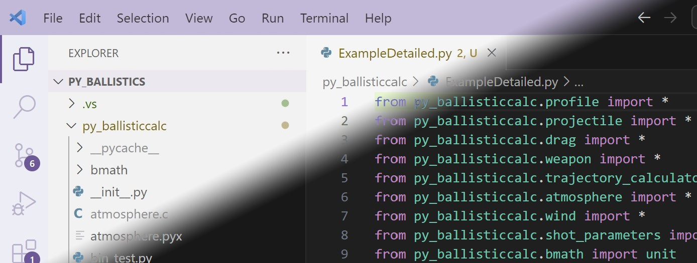
The Light Mode vs Dark Mode GUI question has become somewhat polarizing. Increasing numbers of apps have added Dark themes that use a black background. I generally prefer light mode for one very specific and widely applicable reason, even though I grew up with “dark” displays.
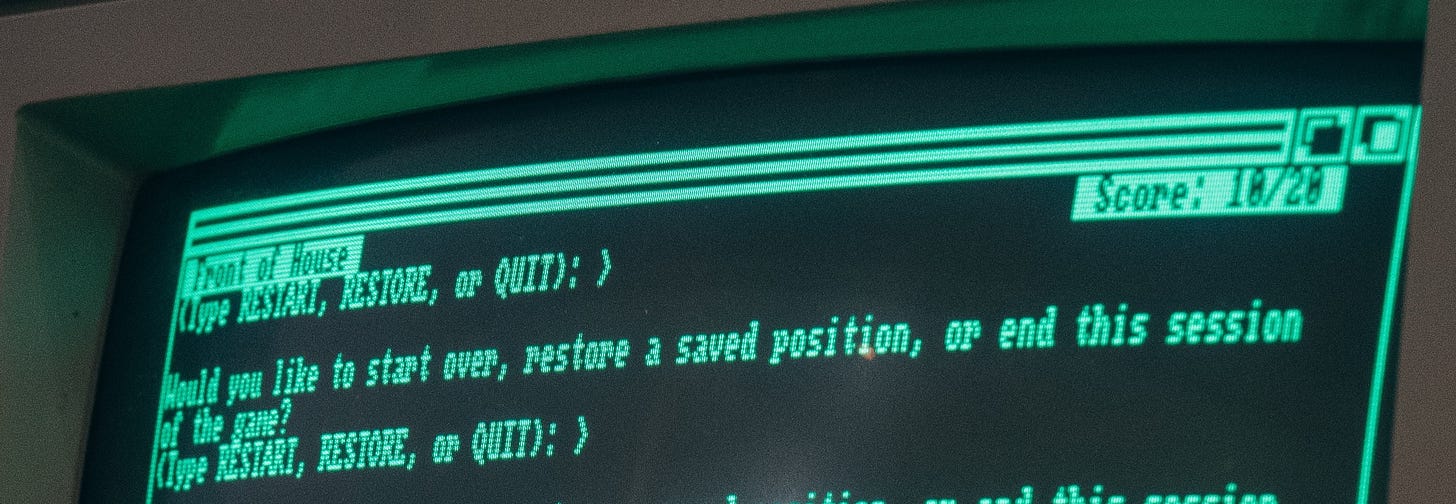
In the old days – back when all computer displays were cathode ray tubes (CRTs) and PCs only had enough memory to display 25 lines of 80 characters of text in a fixed font – screens were black with white, green, or amber text, like this:
It was possible to invert these to show the text as black on light. But as far as I remember, the first computer to mainstream a uniformly light background with black text was the 1984 Macintosh. And I thought it was grotesque. The pixels on those old monitors were not very sharp, so instead of bright text characters bleeding a little onto a black background, a white background seemed to accentuate the blurriness as it bled into the black text pixels. (In fact, on color screens the individual red green and blue phosphors that made up each white pixel would stand out if viewed closely.) For me, fewer illuminated pixels was better.
By the end of the 1980s, CRT monitors had significantly improved in both resolution and pitch, making everything more crisp and making light backgrounds more tolerable. WYSIWIG became all the rage, and since most computer work was done to be printed on white paper GUIs defaulted to white backgrounds with black text – Light Mode. There was also a lot of contemporaneous research, as detailed in this seminal article, that supported the idea that humans work better in Light GUIs.
However, even in the enlightened 1990s programmers spent their time in text terminal windows and development environments that to this day default to dark mode. For example, in Windows open a command terminal by going to Start and typing “cmd”. So I do have some nostalgia for the dark-mode days.
And then I grew into my mid-40s. Most people in middle age will get presbyopia, which is a reduced ability to focus at close distances. (This is due to a consistent decrease over time in the flexibility of the eye’s natural lens.) I can no longer read small or dim text without reading glasses to push the focal distance further out. And this is where light mode shines.
Photographers know that the wider the aperture of a lens, the more shallow the range of things that can be in focus (a.k.a., depth of field). As the aperture closes, depth of field increases. At the limit, a pinhole aperture has an infinite depth of field: everything is in focus no matter what its distance from the viewer.1
The same physics hold for eyes: the wider our pupils open, the more our lenses have to deform to shift focus, and the more apparent is any astigmatism. As our pupils close more of our field of view comes into focus. In fact, if you look through a pinhole everything will be in focus, no matter how extreme an eyeglass prescription you may have.

You can test this yourself: Find some small print and bring it so close to your eyes that it becomes blurry. (If your eyes are so young or flexible that bringing it right up to your eyes doesn’t make it blurry, take it into a darker environment so that your pupils dilate.) Now close one eye, and with the other one look at the text through a pinhole opening held right in front of that eye. You can make a literal pinhole by punching a tiny hole in a piece of paper, or you can create one by closing your fingers together leaving only a tiny opening. Now you will be able to clearly see what was out of focus before.
The problem with pinholes is that they don’t admit much light. So everything you look at through a pinhole will be in focus, but without adequate illumination it might be too dim or low-contrast to read.
What does this have to do with UI themes? Light Mode puts out more light, which causes your pupils to contract, which increases the depth of field of your lens and allows your eyes to focus on objects that are closer. For any given display brightness, there will be a distance at which text is too close for me to read without glasses or eyestrain in Dark Mode but where the same text will still be readable without glasses in Light Mode.
The following illustration demonstrates this. I set a pill bottle just inside the closest distance this lens can focus at maximum aperture (f/1.7), so the text is blurry (second row of photos). Then I closed the aperture as tight as it goes (f/22) and took the photo again (third row of photos). Now the text is clear. The cost: To get the same exposure required a shutter speed of only 1/640 second at maximum aperture, but 1/4 second at minimum aperture.


I had no idea! very interesting